on
Expert Predictions and Incumbency
 ## Part 1: Can we trust expert predictions?
Expert predictions have long been a method to assure voters of order in a volatile political climate. We have come to a point where we trust models from big media sources and academics that are based on a small number of elections with reliable data along with a couple of heavy handed assumptions. But as Enos and Hersh show in their 2015 paper, “Campaign Perceptions of Electoral Closeness: Uncertainty, Fear and Over-Confidence”, political campaign operatives tend to be overconfident in their candidates’ performance, skewing the perception of the closeness of an election. The pattern of questionable accuracy and utility of these models is only worsened when moving from presidential to midterm election years. Many expert forecasts are simply trusted for their role as a crutch for stability, rather than being seriously questioned for their reputability. And newer tools which claim to improve predictions can be an even more confusing curveball. Despite all this noise, we can assess these models by relying on reasonable standards of judgment. One of the methods of testing that I will show involves retroactively comparing actual election results to the predictions.
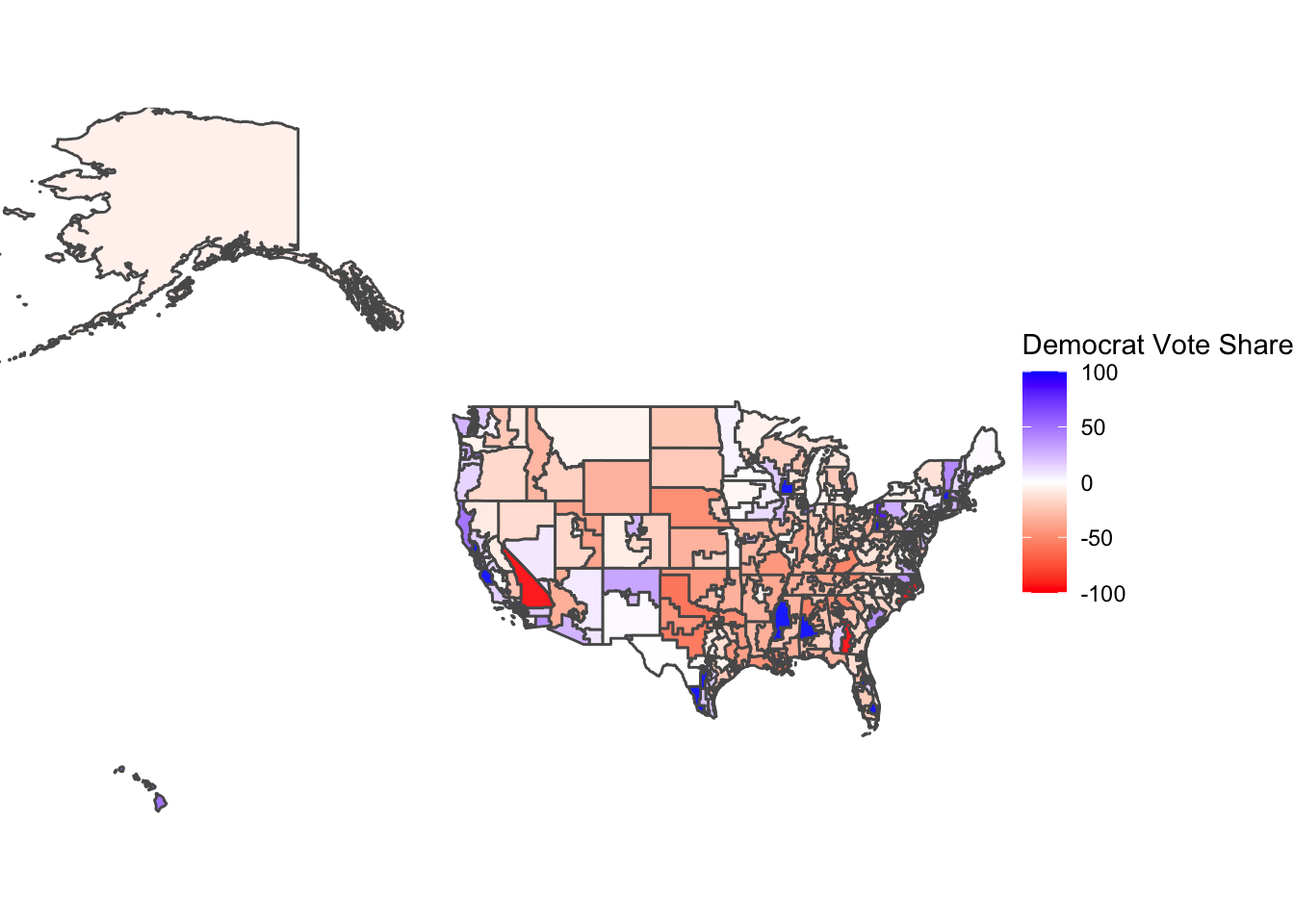
The first map (above) visualizes Democratic voteshare at the district level in 2018, based on the Democrat vote share percentage. The map holds many districts that are blue and those that lean towards Democrats. What can be observed is a larger voteshare for Democrats at the district level. The districts which voted red during the 2014 midterms, such as California’s 4th district, Washington’s 4th district, and Texas’s 11th district, all had visibly increased Democrat voteshare. An exception to this trend (of previously Republican leaning districts starting to vote more blue) is California’s 8th district, which had a high GOP voteshare but this was only because two Republicans were the only candidates. Even though Democrats improved their performance compared to the 2014 midterms and the 2016 presidential elections and boasted a couple strong Democrat districts, such as Mississippi’s 2nd district and Alabama’s 7th district, the nationwide popularity for Republicans was still persistent in 2018.
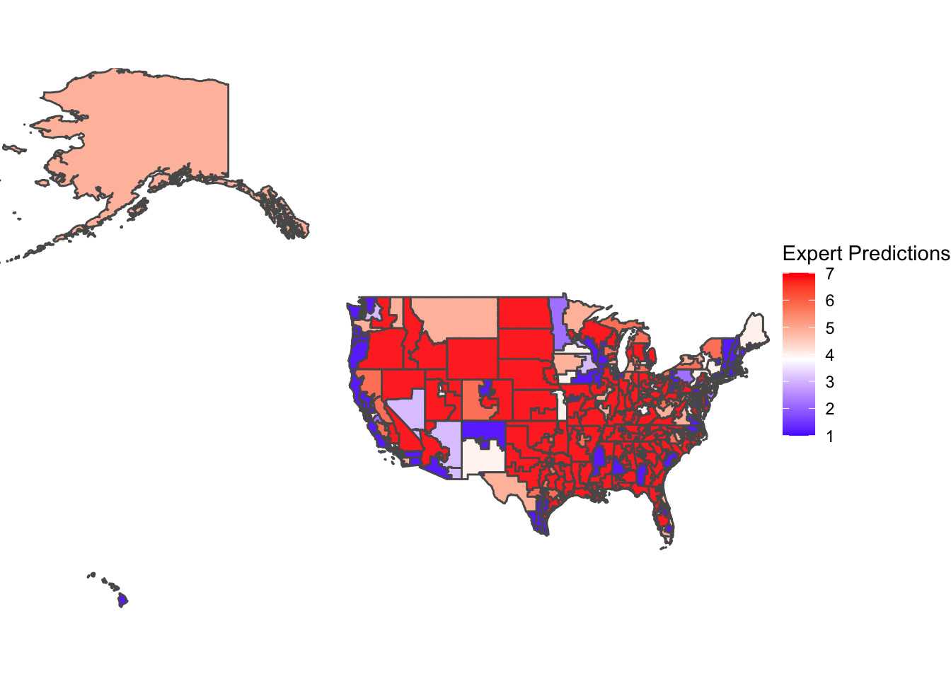 The above map visualizes expert predictions based on the Cook Political Report data at the district-level in 2018. Overall, the predictions are more extreme in both directions (in that there are more districts that are safe Democrat or safe Republican) than the actual voteshare. There seems to be 1) a much larger proportion of secure red districts (visualized by a strong Republican lean) and 2) stronger blue districts, especially along the West Coast. However, we must assess the first takeaway with a grain of salt — the overreporting of secure Republican districts may seem more than it actually is because the visualization of the data can be misleading with the bigger areas of districts in rural areas.
Recent elections have only been stronger in support that guesses from experts based on polls may not be the most accurate tool in election forecasting. In his 2021 study “Failure and Success in Political Polling and Election Forecasting”, Andrew Gelman explains that the polls and fundamentals-based election forecasting in both recent presidential elections with both Clinton and Biden are examples of the overstatement of Democratic strength, a pattern also seen in recent congressional elections. Through Gelman’s experience studying public opinion, he attributes the large proportion of swing in polls to a type of polling bias called “differential nonresponse”, in which supporters of candidates are more vocal in surveys when their candidate does well. This phenomenon, accompanied by high correlations between each party’s share of support in each poll and the percentage of partisans among respondents, only highlights the growing variable of partisanship. Gelman finds that there is a historical overestimate of Democrat performance due to factors such as this differential nonresponse and differential turnout. However, the 2018 elections were a place for predictions to redeem their quality.
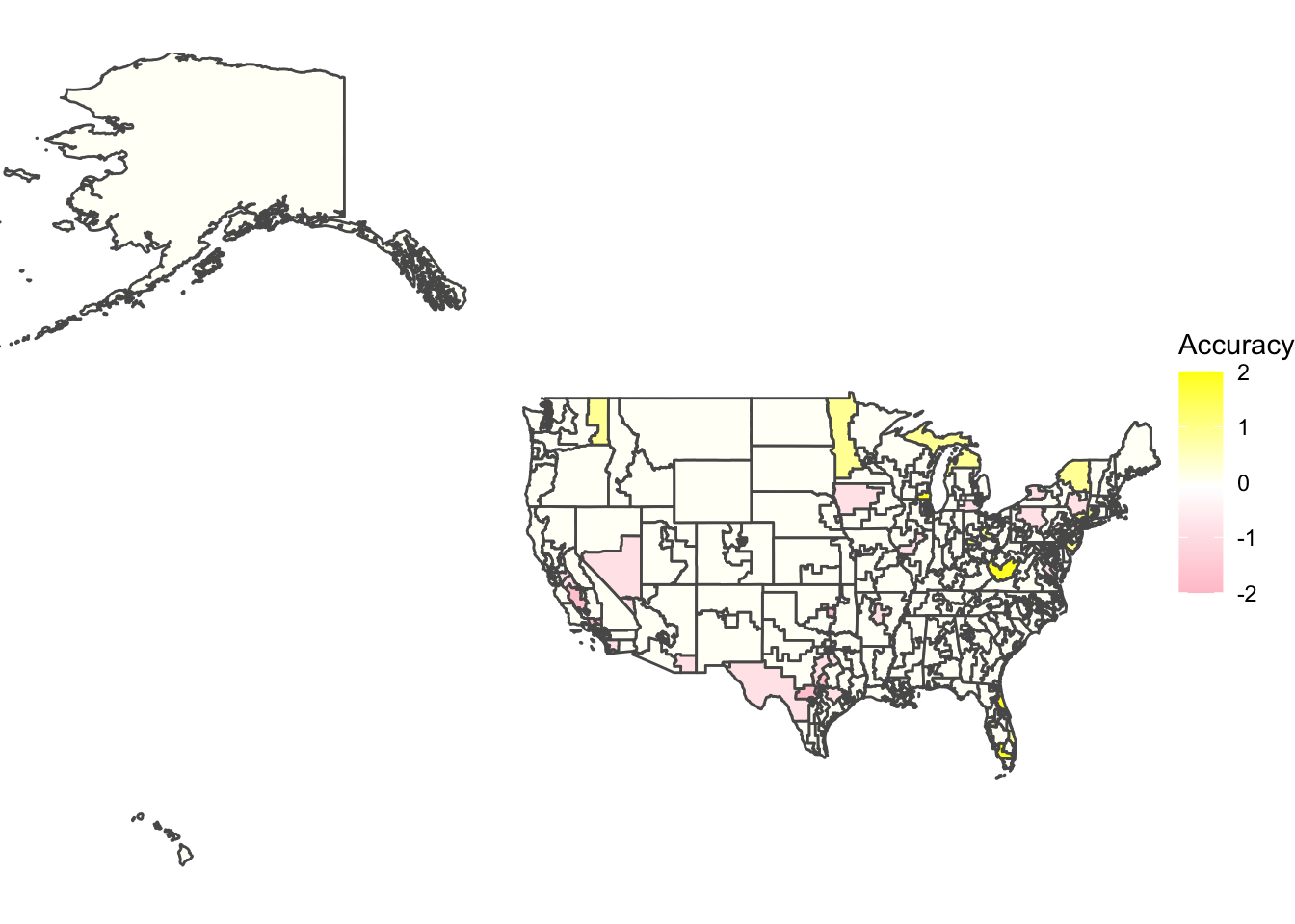 The third map shows exactly this result, with many districts yielding a difference close to 0 in accuracy between the actual voteshare and the expert predictions. This meant that the 2018 predictions had a fairly consistent accuracy and if there were differences between the first two maps, they were minimal. The NYT article “What the Polls Got Right This Year, and Where They Went Wrong” found that while their own 2018 predictions experienced a significant increase in accuracy compared to the 2016 elections, the polls underestimated Democrats in several states where they also underestimated Democrats in 2016 like California, New York, and Nevada. “Our polls did not overestimate Democrats in the less educated states and districts of the East, where one might expect the phenomenon to show up, though they did underestimate Democrats in California and the Southwest.” The 2018 expert predictions seemed to quell unease around expert accuracy by providing many precise results. While there was some error, it was small and mostly negative, with most error tending to underestimate Democrats’ performance and overestimate Republicans’. Examples can be found in Minnesota’s 7th district, which underestimated Republicans and Nevada’s 4th congressional district, which underestimated the Democrats. This type of error, which was also found in Florida, was to be expected, especially looking at the patterns from previous years.
While recent poll-based forecasting from 2016 and 2020 give more and more reason to distrust expert opinions, 2018 was a good year for expert accuracy and optimizing probabilistic forecasting tools to understand how the American public feels about upcoming elections. Before the 2018 midterm, Andreas Grafe found in “Predicting elections: Experts, polls, and fundamentals” that a weighted ensemble of polls, individual experts, and a fundamentals-based forecast is most helpful in reducing polling errors and optimizing results. “Combining expert forecasts and polls with such a fundamentals-based reference class forecast reduced the error of polls and experts by 19% and 24%, respectively.” Grafe provides evidence on the accuracy of expert judgment in forecasting elections. He claims that even though the directional error of polls are correctly predicted by expert forecasts, the error of a typical expert’s vote share forecast was on average about 7% higher than a polling average. Overall, it is difficult to say whether expert predictions by themselves are sources we can trust to predict an election. It seems as though the 2018 election was a chance where expert forecasters could redeem themselves and their work, but we should continue to hold predictions to a high standard and always strive to improve upon them.
Current Model: Combining Economic Variables
To simplify a daunting task, I attempted a model with a couple combinations of economic indicators, along with the Democrat Majority Vote Percent Lag. All four regression models are detailed below:
##
## Call:
## lm(formula = D_seats ~ GDP_Growth_Pct + US_CPI + US_Unemployment_Rate,
##     data = EE_data)
##
## Residuals:
##     Min      1Q  Median      3Q     Max
## -37.478 -19.793  -1.232  17.542  38.807
##
## Coefficients:
##                      Estimate Std. Error t value Pr(>|t|)
## (Intercept)          247.5442    17.7172  13.972 2.06e-15 ***
## GDP_Growth_Pct        -0.9832     1.7011  -0.578    0.567
## US_CPI                -0.2596     0.0505  -5.141 1.22e-05 ***
## US_Unemployment_Rate   1.4595     0.8740   1.670    0.104
## ---
## Signif. codes:  0 '***' 0.001 '**' 0.01 '*' 0.05 '.' 0.1 ' ' 1
##
## Residual standard error: 23.46 on 33 degrees of freedom
## Multiple R-squared:  0.4473, Adjusted R-squared:  0.3971
## F-statistic: 8.903 on 3 and 33 DF,  p-value: 0.0001827
The first regression model created was based solely on a couple economic indicators I found important. The only significant variable among these though was the U.S. CPI (significant at 0.1%), and the adjusted R-squared showed that only 39.71% of the variation in the Democratic seats won could be predicted using the model.
Democratic seats = 247.544 - 0.983(GDP Growth Percentage) - 0.26(U.S. CPI) + 1.46(U.S. Unemployment Rate)
##
## Call:
## lm(formula = D_seats ~ D_majorvote_pct_lag + GDP_Growth_Pct +
##     US_CPI + US_Unemployment_Rate, data = EE_data)
##
## Residuals:
##     Min      1Q  Median      3Q     Max
## -46.266 -14.179   0.233  15.271  45.687
##
## Coefficients:
##                      Estimate Std. Error t value Pr(>|t|)
## (Intercept)          32.16837   75.92036   0.424  0.67470
## D_majorvote_pct_lag   4.51176    1.56446   2.884  0.00708 **
## GDP_Growth_Pct       -3.00432    1.70586  -1.761  0.08807 .
## US_CPI               -0.17638    0.05428  -3.250  0.00278 **
## US_Unemployment_Rate  0.08993    0.95129   0.095  0.92530
## ---
## Signif. codes:  0 '***' 0.001 '**' 0.01 '*' 0.05 '.' 0.1 ' ' 1
##
## Residual standard error: 21.44 on 31 degrees of freedom
##   (1 observation deleted due to missingness)
## Multiple R-squared:  0.5594, Adjusted R-squared:  0.5025
## F-statistic:  9.84 on 4 and 31 DF,  p-value: 2.939e-05
The second model was essentially the same model with another variable, the Democratic Majority Vote Percentage Lag. For a regression analysis, I included this independent variable, which was the previous election cycle’s dependent variable measuring Democrats’’ popularity’ resulting vote share in election outcomes. The R-squared was slightly improved to 50.25% and more variables were significant (Democrat Majority Vote Percentage Lag and U.S. CPI at 1% and GDP Growth Percentage at 10%). The U.S. Unemployment Rate was not significant.
Democratic seats = 32.168 + 4.518(Democrat Majority Vote Percentage Lag) - 3.004(GDP Growth Percentage) - 0.176(U.S. CPI) + 0.090(U.S. Unemployment Rate)
##
## Call:
## lm(formula = D_seats ~ D_majorvote_pct_lag + GDP_Growth_Pct +
##     US_CPI, data = EE_data)
##
## Residuals:
##     Min      1Q  Median      3Q     Max
## -45.761 -14.137   0.123  15.319  45.801
##
## Coefficients:
##                     Estimate Std. Error t value Pr(>|t|)
## (Intercept)         29.66162   70.02836   0.424  0.67472
## D_majorvote_pct_lag  4.58906    1.31290   3.495  0.00141 **
## GDP_Growth_Pct      -3.06832    1.54132  -1.991  0.05511 .
## US_CPI              -0.17426    0.04863  -3.583  0.00111 **
## ---
## Signif. codes:  0 '***' 0.001 '**' 0.01 '*' 0.05 '.' 0.1 ' ' 1
##
## Residual standard error: 21.11 on 32 degrees of freedom
##   (1 observation deleted due to missingness)
## Multiple R-squared:  0.5593, Adjusted R-squared:  0.518
## F-statistic: 13.54 on 3 and 32 DF,  p-value: 7.158e-06
Attempting to make further improvements, I tried taking out the one variable which was not significant in the second model (U.S. Unemployment Rate), limiting the model to Democratic Majority Vote Percentage Lag, GDP Growth Percentage, and U.S. CPI. The Democrat Majority Vote Percentage Lag and U.S.CPI were both significant at 1% and the GDP Growth Percentage was significant at 10%. The R-squared value improved slightly to 51.8%, but overall I was still unsatisfied with this model.
Democrat seats = 29.662 + 4.589(Democrat Majority Vote Percentage Lag) - 3.068(GDP Growth Percentage) - 0.174(U.S. CPI)
##
## Call:
## lm(formula = D_seats ~ D_majorvote_pct_lag + GDP_Growth_Pct +
##     US_CPI + Pres_R, data = EE_data)
##
## Residuals:
##     Min      1Q  Median      3Q     Max
## -44.932 -15.830  -0.609  15.512  47.780
##
## Coefficients:
##                     Estimate Std. Error t value Pr(>|t|)
## (Intercept)         14.64954   78.03902   0.188  0.85232
## D_majorvote_pct_lag  4.80193    1.40741   3.412  0.00181 **
## GDP_Growth_Pct      -2.80072    1.66530  -1.682  0.10265
## US_CPI              -0.16660    0.05197  -3.205  0.00312 **
## Pres_R               3.86733    8.39654   0.461  0.64831
## ---
## Signif. codes:  0 '***' 0.001 '**' 0.01 '*' 0.05 '.' 0.1 ' ' 1
##
## Residual standard error: 21.37 on 31 degrees of freedom
##   (1 observation deleted due to missingness)
## Multiple R-squared:  0.5623, Adjusted R-squared:  0.5058
## F-statistic: 9.955 on 4 and 31 DF,  p-value: 2.668e-05
In the fourth model, I added a dummy variable (whether the President during the time of the election was a Republican or not) while keeping the variables that worked (Democratic Majority Vote Percentage Lag, GDP Growth Percentage, and U.S. CPI). The Democrat Majority Vote Percentage Lag and U.S. CPI were both significant at 1% and the R-squared was improved to 50.58%.
Democrat seats = 14.650 + 4.802(Democrat Majority Vote Percentage Lag) - 2.801(GDP Growth Percentage) - 0.167(U.S. CPI) + 3.867(Republican President)
##        1
## 196.8491
## fit lwr upr
## 1 196.8491 149.1047 244.5935Prediction Results Based on Model: Looking closer into the third model using Democratic Majority vote Percentage Lag, GDP Growth Percentage, and U.S. CPI to predict Democratic seat share, the model’s predictive interval ranges from about 150 to 245 seats, meaning that I was 95% confident that the interval included the true resulting seat share. This range includes the fitted estimate of Democrat seat share in the 2018 House of Representatives elections (197 seats), which was a shocking 38 seats higher than the actual seat share of the Democrat party in that election. While the estimate included the actual result, the range was very large so there can be further improvement to narrow down the confidence interval values.
Part 2: What role do economic variables play in incumbency?
To evaluate incumbency, I looked specifically at the three economic indicators I mentioned previously in my model (GDP Growth Percentage, U.S. CPI, and U.S. Unemployment Rate). I graphed the actual results (which are represented by the points) with the available data against the model showing the relationship between the GDP Growth Percentage and each economic indicator individually, attempting to see which indicator was closest to the actual percentages of House Incumbent vote share.
##
## Call:
## lm(formula = H_incumbent_party_majorvote_pct ~ GDP_Growth_Pct,
##     data = EE_data)
##
## Residuals:
##     Min      1Q  Median      3Q     Max
## -6.1703 -1.7524 -0.2146  2.1449  6.2617
##
## Coefficients:
##                Estimate Std. Error t value Pr(>|t|)
## (Intercept)     52.7003     0.9180  57.409   <2e-16 ***
## GDP_Growth_Pct  -0.2937     0.2314  -1.269    0.213
## ---
## Signif. codes:  0 '***' 0.001 '**' 0.01 '*' 0.05 '.' 0.1 ' ' 1
##
## Residual standard error: 3.335 on 35 degrees of freedom
## Multiple R-squared:  0.04398,    Adjusted R-squared:  0.01667
## F-statistic:  1.61 on 1 and 35 DF,  p-value: 0.2128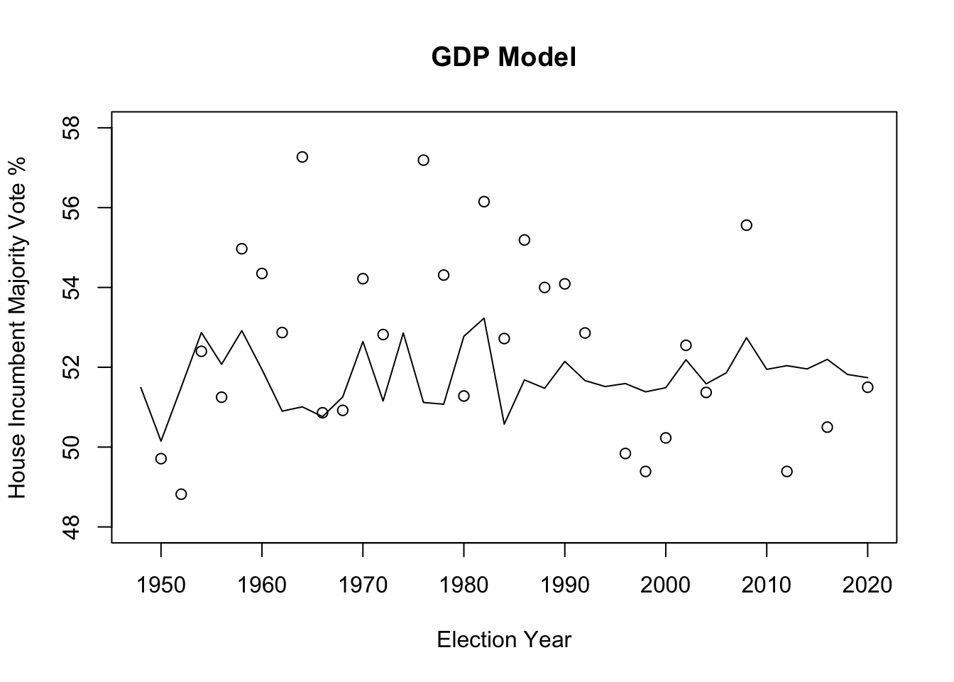
## [1] 3.243329## [1] 0.04398211##
## Call:
## lm(formula = H_incumbent_party_majorvote_pct ~ US_Unemployment_Rate,
## data = EE_data)
##
## Residuals:
## Min 1Q Median 3Q Max
## -7.3781 -1.6452 0.2231 2.4071 6.8927
##
## Coefficients:
## Estimate Std. Error t value Pr(>|t|)
## (Intercept) 48.5044 2.0687 23.447 <2e-16 ***
## US_Unemployment_Rate 0.1875 0.1148 1.633 0.111
## ---
## Signif. codes: 0 '***' 0.001 '**' 0.01 '*' 0.05 '.' 0.1 ' ' 1
##
## Residual standard error: 3.288 on 35 degrees of freedom
## Multiple R-squared: 0.07082, Adjusted R-squared: 0.04427
## F-statistic: 2.668 on 1 and 35 DF, p-value: 0.1114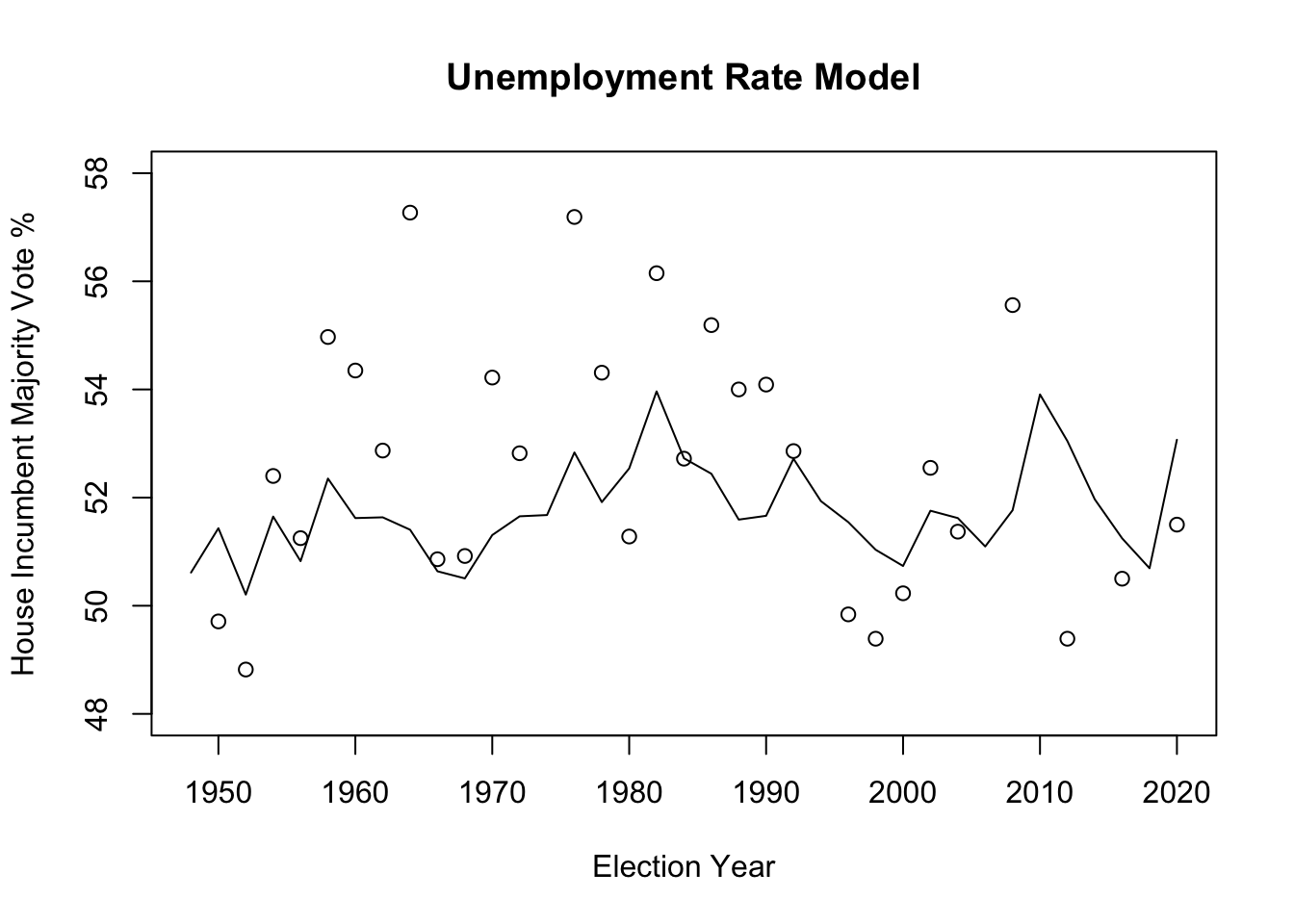
## [1] 3.197479## [1] 0.07082147##
## Call:
## lm(formula = H_incumbent_party_majorvote_pct ~ US_CPI, data = EE_data)
##
## Residuals:
## Min 1Q Median 3Q Max
## -6.7532 -2.2432 -0.2191 1.9532 5.6638
##
## Coefficients:
## Estimate Std. Error t value Pr(>|t|)
## (Intercept) 53.778661 0.885015 60.766 < 2e-16 ***
## US_CPI -0.017690 0.006372 -2.776 0.00877 **
## ---
## Signif. codes: 0 '***' 0.001 '**' 0.01 '*' 0.05 '.' 0.1 ' ' 1
##
## Residual standard error: 3.088 on 35 degrees of freedom
## Multiple R-squared: 0.1805, Adjusted R-squared: 0.1571
## F-statistic: 7.707 on 1 and 35 DF, p-value: 0.008772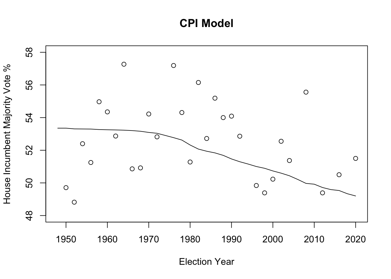
## [1] 3.002903## [1] 0.1804671Conclusion on Updated Model:
lm_1: y = pop vote = -0.2397(GDP Growth Pct) + 52.7003 lm_2: y = pop vote = 0.1875(U.S. Unemployment Rate) + 48.5044 lm_3: y = pop vote = -0.017690(U.S. CPI) + 53.7787 **note: For each model, the estimated coefficients for the independent variable indicates a marginal effect on the dependent variable, which is popular vote for the incumbent. Ex: For Model 1, a 1 unit increase (1% increase in annual GDP Growth Percentage) yields a decrease of 0.2397% in House Incumbent Party Majority Vote Percentage. For Model 2, a 1 unit increase (1% increase in the U.S. Unemployment Rate) yields an increase of 0.1875% in House Incumbent Party Majority Vote Percentage. For Model 3, a 1 unit increase (1% increase in the U.S. Consumer Price Index) yields a decrease of 0.01769% in House Incumbent Party Majority Vote Percentage. Below, I assess the accuracy of each of these models.
The GDP Growth Percentage seems to hold the lowest predictive power in estimating the marginal effect on the popular vote. With a relatively high mean-squared error (measures the standard deviation of the residuals/how far the results were from the regression line) of about 3.2433 and a low R squared value of 0.044, Model 1 has the lowest accuracy in the linear regression model predicting popular votes. In Nate Silver’s article on FiveThirtyEight, “Which Economic Indicators Best Predict Presidential Elections?”, it was found that “There is definitely a relationship between G.D.P. and election results. But, it isn’t a perfect one. Overall the r-squared for G.D.P. is .33 in elections since 1948. That is, about 33 percent of election results are explained by G.D.P., leaving about two-thirds of the results unexplained.”
The U.S. Unemployment Rate is in the middle with its predictive power with a mean-squared error of about 3.1975 and a R squared value of 0.0708. While there exists literature on the relationship between unemployment rate and approval rates of the President and Congress, there is a lack of clear information on the chances of re-election. Five Thirty-Eight ambiguously concluded that the data is not strong enough to prove a relationship between unemployment rate and popular vote, but “it is also not strong enough to disprove a relationship.”
CPI is a natural measure of inflation and when it goes up, it yields a decrease of 0.01769%, giving a conclusive effect. Out of all 3 models, the CPI factor has the smallest mean-squared error of about 3.0029, indicating that this is the best performing model and holds the highest predictive power out of all 3 in estimating the House Incumbent Party Majority Vote Percentage. Another reason this model may be the closest in accuracy of prediction is that it is the only one that is statistically significant. As the R squared value gets higher, it indicates how much variation of y values in the sample is captured by the fitted model’s predicted values, and how much can be explained by the estimation models. CPI has the highest R squared value of 0.1805. Even though about 82% of the variation is not captured, it is still the best predictive model we have on hand. Through Model 3, based on CPI, we find that if the CPI continuously increased over time, it is natural to see the continuously decreasing popular vote (predicted value in dots). The Pew Research Center found that inflation is a key factor in their voting decisions, and in the context of Democrats controlling the House and the presidency, personal financial ratings in response to inflation lean more negative, especially for Republicans. Overall, Democrat views of the economy, while negative, are still more positive than Republicans’. “The Electoral Impact of Unexpected Inflation and Economic Growth” by Harvey Palmer and Guy Whitten reveals through empirical analysis stronger electoral effects for unexpected inflation and growth, serving as reliable indicators of government competence to voters and therefore lending itself to higher or lower approval rates/incumbent popularity. Of course, there are many more economic factors of wellbeing that are more well-favored by political scientists, such as growth in real disposable income, but for the time being, CPI is most accurate.